
When we moved in the kitchen was useable (after a good scrub) but very badly laid out.

The sink and cooker were immediately adjacent with just one small square of work surface on the left hand side. There was nowhere to stack washing up (and no dishwasher).


 At the end of the room this large floor-to-ceiling cupboard contained the boiler and nothing else. A total waste of space!

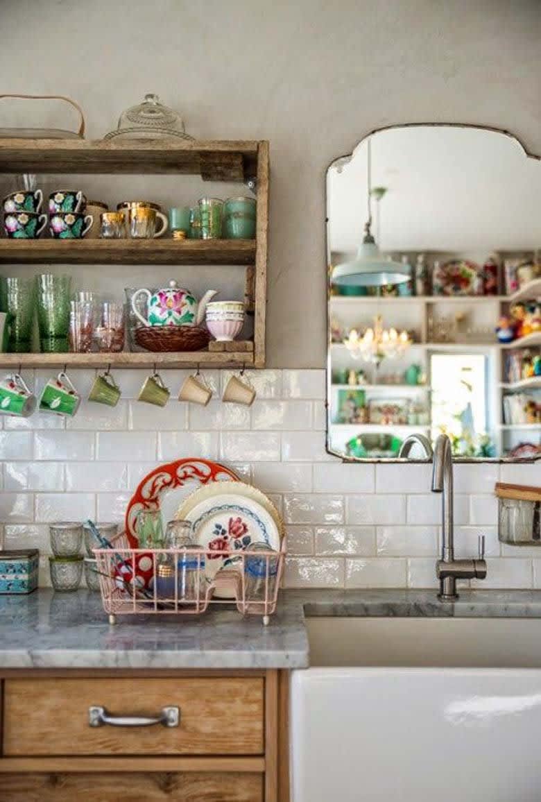
For the design and feel I started out looking at open shelving and pastel colours with a vintage vibe. I love this look and have lots of vintage china which could be displayed. However, we anticipate that we’ll only be here for two or three years before moving on so I decided that a simple modern kitchen would be the easiest to sell on. Plus open shelves look beautiful but in a small kitchen they will pick up dirt and grease too easily so it’s not practical.

(Image credit: PMOSQ) via www.thekitchn.com
So I started to look into modern white kitchens with a bright colour splash back to give it some interest. I knew I wanted white gloss doors to bounce as much light as possible around the room and grey vinyl flooring which I don’t think anyone could complain about when we come to sell. However, I wanted to add some colour with an acrylic splashback and was having an orange moment at the time. I found Splash Acrylic very easy to deal with. They have a good range of colours, send free samples for you to select from and delivered quickly and easily.
For the cabinets and appliances we went to Howdens with our builder. Howdens design the room in 3D on a computer projected onto a large screen and it was exciting to see all the options. The practical things I specifically wanted were: a dishwasher, big drawers for pans etc and the sink to be positioned under the window.
Our design removed the pointless boiler cupboard replacing the boiler itself with a much smaller model which fitted into a standard kitchen wall unit. This allowed us to make the left hand run of cabinets into an L shape across the end of the room giving us more cabinet and worktop space.
I love this stage when everything is removed. Just look at all those pipes! These caused some issues as it meant the cabinets had to sit away from the walls.

The new layout.


I didn’t know what worktops I wanted but I knew we couldn’t spend a lot of money so that limited my choice to laminate. They are much better than the last time I updated a kitchen though and when I saw this sparkle flecked design with squared edges I was smitten. It’s very difficult to photograph so you’ll have to take my word for it that it’s beautiful in real life.
I am very pleased with the final results, however I think I played too safe with the orange splashback so I’m deciding whether to order a few more sections for the window end of the room.


